
The Offer Image Guide: artwork spec for Fan Offers
By David Sullivan & James Hodge · Updated
Everything a designer needs to build artwork for a Fan Offer, on one page they can work from without asking you a single question.
What it covers
-
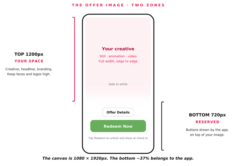
1The two-zone diagram, print ready
-
2The full canvas spec: 1080 × 1920, top 1200px yours, bottom 720px reserved
-
3Still, animation and video — what changes for each
-
4The three rules that keep artwork readable behind the buttons
-
5The launch tile spec at 500 × 200, with safe margins
-
6A one-page brief to forward to a sponsor’s designer
Free download
Get the guide
The full guide as a printable PDF. No email required, no form to fill in — just hit download and forward it to whoever is making the artwork.
Download the PDFPDF · Tiparra-Offer-Image-Guide.pdf
Most artwork that comes back wrong comes back wrong for the same reason: nobody told the designer that the bottom third of the image is not theirs.
The app draws the Offer Details and Redeem buttons over the lower portion of the picture. A designer who does not know that will centre the logo, put the headline across the middle, and hand back something that looks broken the moment it is loaded. They had no way of knowing.
This guide exists so that conversation happens once, in writing, before the work starts.
The canvas, in short
Top 1200px is yours
Photo, headline, branding, full-bleed. It can be a still, an animation or a video. All three work.
Bottom 720px belongs to the app
It draws the Offer Details and Redeem buttons over your image, so anything placed there gets covered.
The full canvas is 1080 × 1920. The bottom roughly 37% belongs to the app.
The three rules
Fade the bottom to white. The buttons are dark on light, so a light lower third keeps them readable. For video, make the lower portion light throughout the loop rather than only on the final frame.
Keep faces and logos high. Do not centre a face vertically. The buttons will land on it.
Say the important thing up top. The offer should read from the top portion alone.
The second asset
Alongside the offer image is a launch tile at 500 × 200 — the tile a supporter taps to open the offer. One message, large type, and key content kept inside a safe margin so rounded corners do not clip it.
Both assets can be uploaded directly or pulled from the CMS, so a sponsor’s artwork is stored once and reused all season.
Forward it, do not paraphrase it
The PDF has the diagrams at full size and a one-page brief written for a designer. Send that rather than retyping the spec into an email.
Download the PDF